A logo is more than a symbol. It represents a company's identity, values, and the promise it makes to its audience. As businesses grow and their services evolve, their visual identities often change to reflect their new direction.
In the EdTech industry, this evolution is particularly interesting. Companies that once focused on a specific audience or service may expand into new areas, introduce innovative technologies, or build broader educational ecosystems. Their branding needs to communicate this growth.
From expanding access to education to connecting learning with career opportunities, several education-focused organisations have refreshed their visual identities to align with their evolving missions.
Here are five examples of EdTech and education-focused companies whose brand identities illustrate how a logo can communicate a bigger vision.
1. SheKunj: From a Women-Focused Platform to Education for Everyone
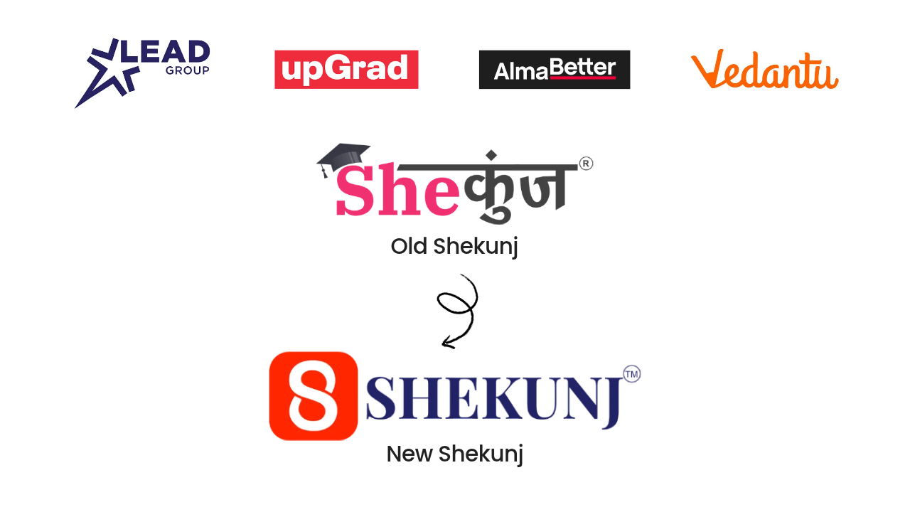
SheKunj's new logo represents an important step in the evolution of its brand and mission.
Initially, SheKunj's identity was closely associated with women-focused initiatives and community empowerment. As the platform developed, its scope expanded to include education, career opportunities, hackathons, internships, mentorship, skill development, and media initiatives.
This expansion brought a broader audience into the picture, including students, young professionals, educational institutions, and industry communities.
The challenge was no longer simply to represent a particular community. It was to create an identity that could accommodate a wider educational and professional ecosystem.
What does the new logo represent?
The refreshed SheKunj identity introduces an infinity-inspired “S”, representing continuous growth, learning, and development. The orange box creates a distinct visual space associated with energy, creativity, and a supportive environment for students, creators, and young professionals.
The design reflects a platform that is evolving alongside the needs of its audience.
The shift does not mean moving away from women's empowerment. Instead, it expands the brand's scope so that its existing community initiatives can coexist with a wider mission of education and opportunity.
Why was this change important?
Education is not limited to one gender, age group, or professional background. As SheKunj expanded into educational initiatives and career development, its identity needed to communicate that broader purpose.
The refreshed logo reflects a transition from a more narrowly associated identity towards a platform designed to serve a wider community.
It also gives SheKunj a more flexible visual foundation for its different activities, from educational events and career opportunities to podcasts, professional stories, and community initiatives.
The bigger message: SheKunj is evolving with a simple belief: education, learning, and opportunities should be accessible to everyone.
Website: https://www.shekunj.com/
2. LEAD Group: From LEAD School to a Broader EdTech Identity
LEAD Group provides another example of how a company's identity can evolve alongside its business model.
In July 2021, LEAD School rebranded as LEAD. The change reflected its development from a school-focused identity into a broader education technology business working with schools to improve learning outcomes. The updated identity was designed to communicate educational progress, opportunity, and growth.
Why did the identity evolve?
As the company expanded its work with partner schools, its role extended beyond the idea of a single school or traditional classroom. It increasingly focused on providing educational solutions that schools could use to improve teaching and learning.
The shorter LEAD identity supported this wider positioning.
The new visual identity incorporated a distinctive brand mark, a bold colour palette, and consistent typography. According to the branding agency involved, the design was intended to communicate optimism, confidence, and advancement.
What does this change demonstrate?
LEAD's evolution illustrates how a brand can use a new identity to communicate a change in its role within the education ecosystem.
Rather than being associated only with the concept of a school, the company could present itself as an education technology partner serving multiple institutions.
The bigger message: When a company's services expand, its identity can evolve to represent a wider role in education.
3. upGrad: Building an Identity Around Career Growth
upGrad is focused on higher education, professional learning, and career development. Its visual identity has been developed to reflect the aspirations of learners seeking to improve their qualifications, build new skills, and progress professionally.
The design work by Design Stack focused on aligning the company's identity with its positioning as an online higher education platform for career-oriented learners.
How does its identity communicate the brand?
The visual identity uses distinctive typography and an upward-pointing arrow motif to communicate progress and professional advancement.
These design elements connect with the aspirations of learners who want to advance in their careers, change professional directions, or develop specialised expertise.
The branding also aims to balance professionalism with approachability, reflecting the needs of people returning to education while working or managing other responsibilities.
Why is this relevant to EdTech branding?
For a career-oriented education company, the brand needs to communicate more than access to courses. It should also reflect the possibilities that education can create for learners.
upGrad's visual identity demonstrates how design elements can support a clear positioning around professional growth.
The bigger message: Education can be presented not just as a learning experience, but as a pathway to new professional possibilities.
4. Vedantu: Creating a More Approachable Learning Identity
Vedantu has worked on its visual identity as part of its evolution into a public-facing digital learning platform.
In a 2014 design account, the company explained that it needed a clearer identity as it prepared to present its products to a wider audience. The branding process involved simplifying the design, gathering feedback, and developing a visual language suited to its learning platform.
Why did the brand need a clearer identity?
As Vedantu developed educational products across different formats, including digital learning tools and applications, it needed a consistent way to present itself to students and parents.
The company's design process focused on creating a recognisable identity that could communicate its educational purpose while remaining suitable for digital experiences.
The design team also explored a bright orange colour palette, described as “Sunrise Orange”, to give the identity a youthful, vibrant, and creative character.
What can other EdTech companies learn from this?
An education brand must work across multiple environments, from websites and applications to learning materials and marketing campaigns.
A clear and consistent identity can help audiences recognise the platform and understand its personality.
Vedantu's early identity work illustrates how visual branding can support the transition from developing educational products to presenting a coherent public-facing platform.
The bigger message: A recognisable identity can help make digital learning feel more approachable and consistent.
5. AlmaBetter: Aligning Branding With Outcome-Driven Education
AlmaBetter offers another example of an education company using rebranding to communicate its evolving positioning.
The company's rebranding project focused on aligning its brand strategy and visual identity with its emphasis on outcome-driven, learner-centric education and preparation for modern careers. The project was recognised in India's design industry in 2023.
What changed in its brand direction?
The rebranding introduced a visual identity centred on transformation and future growth. The design retained the brand's red colour while introducing a more minimal visual approach, including an upward movement motif intended to communicate progress and upskilling.
The identity was also extended across the company's communication materials and digital experiences, helping create a more consistent presentation of its educational offerings.
Why does this matter?
Learners increasingly evaluate educational platforms based on how well their programmes align with career goals and practical outcomes.
A brand that clearly communicates growth, transformation, and professional development can help express its positioning to the audience it serves.
Of course, a logo alone cannot demonstrate the quality of education or guarantee career outcomes. Its role is to communicate the company's intended promise, which must be supported by its actual services.
The bigger message: A brand identity can reinforce a company's commitment to helping learners move towards their goals.
What Do These Five Brand Evolutions Have in Common?
Although these companies operate in different parts of the education ecosystem, their examples illustrate a common principle: a brand's identity should remain aligned with its purpose and direction.
- SheKunj reflects a wider mission that connects education, careers, and community engagement.
- LEAD demonstrates a transition towards a broader school EdTech identity.
- upGrad uses visual elements associated with professional progress and career development.
- Vedantu illustrates the importance of creating a recognisable, approachable identity for digital learning.
- AlmaBetter shows how visual branding can reinforce a focus on learner development and professional outcomes.
Not every company needs a new logo to grow. Sometimes, an updated visual system or clearer brand messaging may be enough. A redesign is most meaningful when it reflects a genuine change in the company's strategy, services, or audience.
Conclusion: A Logo Should Grow With the Brand
The evolution of an educational company is not always visible in its products or services alone. Sometimes, it is also reflected in the way the company presents itself to the world.
For SheKunj, the new identity represents a broader mission: moving beyond its earlier women-focused association to create a platform where education, career opportunities, and community development can serve everyone.
The examples of LEAD, upGrad, Vedantu, and AlmaBetter show different ways that education-focused brands can align their visual identities with their positioning and ambitions.
Ultimately, a successful logo change is not simply about looking different. It is about communicating what a company stands for today, the people it aims to serve, and the direction in which it intends to grow.
As education continues to evolve, the strongest brand identities will be those that remain meaningful, adaptable, and closely connected to the purpose behind the business.